Go back to part 1 of our series on Shiny App Accessibility
This year marks the 30th anniversary of the Americans with Disabilities Act, a transformative civil rights law that followed decades of action by disability activists. It is now commonly recognized that considering accessibility in design choices has ubiquitous benefits, i.e., the “curb cut effect.”1 This holds especially true for technology, such as how captions on videos that make it possible for people with disabilities to access content also provides access to anyone who happens to be in a noisy environment. Along with considering ways to provide long-term access to a shiny app, it’s also a good time to consider how design choices might unintentionally hinder people from using your app.

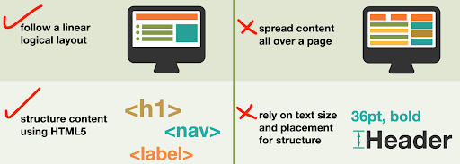
Example dos and don’ts from the UK Home Office posters on designing for accessibility.
Web applications can be inaccessible to users that rely on keyboard navigation or assistive technologies like screen readers. Many websites lack basic accessibility provisions such as providing sufficient color contrast, alternative text for images, or navigable page layouts. This means the functionality of an app can be rendered useless if a user has no way of determining, e.g., whether a checkbox is checked or can’t read text against a low contrast background.
The community that developed standards for the web has a detailed set of technical specifications for Accessible Rich Internet Applications, which developers can implement to ensure that users can effectively interact with elements of a user interface. Many of these are simple changes that, when implemented, more clearly communicate the roles, states, and properties of elements on the page. Here are some steps you can take to evaluate and improve the design of your apps, along with resources to learn more.
Evaluate accessibility
An easy first step is to test out how your application looks and behaves with assistive technology or under certain impairments. Operating systems and web browsers have many built-in tools that allow you to emulate vision deficiencies or the output of assistive technologies like screen readers. Try using your app only with a keyboard to see if you can successfully navigate. There are also a number of tools for evaluating websites against best practices and legal standards such as §508, the part of the ADA specific for information technology, including:
- The Web Accessibility Evaluation Tool, a quick way to highlight problems on any single webpage or Experte for evaluating entire websites.
- One-click emulators to simulate different types of vision deficiencies such as Color Oracle or Google Chrome’s built-in developer tool.
- The website Who Can Use to identify color combinations that meet accessibility standards

It’s a good idea to check whether people who are colorblind will be
able to distinguish between the colors in your maps and figures!
Accessible Shiny features
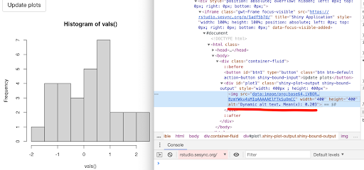
Developers of RShiny have made substantial improvements for implementing accessibility standards, with arguments built into functions you’re already using. For example, a recently implemented feature creates an alt parameter in render*() functions which allows for dynamically updating the alt text HTML attribute on images.2 This text helps conveys the content and purpose of an image for users (e.g. using a screen reader) or situations (e.g. slow internet connection) where images can’t be loaded.3 For example, this code will create an alt text HTML attribute with the mean value of the histogram:
  output$plot1 <- renderPlot(
      {
        hist(vals())
      },
      alt = reactive({
        paste("Dynamic alt text. Mean(x):", round(mean(vals()), 3))
      })
    )

The calculated mean in the alt attribute is viewable in your browser’s "Inspect" or "Inspect element" tool.
Another design consideration is the order in which fields get highlighted when navigating by keyboard instead of a mouse (i.e. using the tab key). By default, elements are navigated based on their order in the code source. You can override the order using the html tag tab index which can be accomplished with the function tagAppendAttributes().
For more advanced control beyond what is possible with standard HTML tags, ARIA attributes can be used to more precisely define what certain user interface elements do and their current status. In many cases these labels have already been incorporated into the source code for Shiny’s user inputs. For example, using a dateInput widget now employs an ARIA-compliant solution that doesn’t require clicking with a mouse.4 The WAVE or Experte tools described above can help determine whether there are features in your app or webpage that could be improved.
For more details, check out the design section of the book Engineering Production-Grade Shiny apps or look through the issues and pull requests regarding accessibility on shiny’s GitHub page.
Resources to learn more
- WebAIM quick reference on web accessibility principles
- The University of Washington page on Accessible Technology
- Accessible Technology in the workplace
- 18F’s Accessibility guide
- Collections of interviews and user profiles of people with access needs
- This is the idea that once assistive technology becomes sufficiently ubiquitous and widely used, it is considered normal. Learn more about the history of curb cuts, their legacy, and an example how video captions benefit students. ↩
- Described in this pull request. Note that this is currently only available in the development version of the shiny package. ↩
- Note that the HTML “alt” attribute is separate from the “title” attribute, which specifies extra or supplementary information about an element and may display when your mouse hovers over that item (depending on your web browser). For this reason, search engine optimization is typically based on the alt attribute, not title. ↩
- See an example of the datepicker ARIA specification in action that was recently incorporated into Shiny. ↩